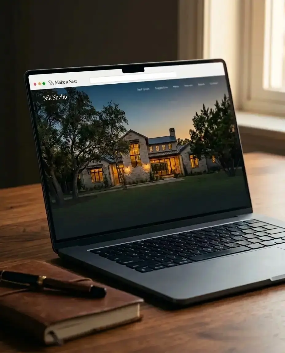
Stopping the Scroll: Moving from "Bright & Corporate" to "Cinematic & Editorial" Real Estate
We have all seen the standard, formulaic real estate photo. It's shot at mid-day with an ultra-wide lens that makes a small hallway look like a bowling alley. The colors are artificially boosted, the sky is a harsh neon-blue gradient, and the front lawn looks like a radioactive shade of green.
For the last decade, this "bright and corporate" style was the industry gold standard for the MLS. But on modern social feeds, it has a glaring problem: it looks exactly like a generic advertisement. The human eye has been trained to instantly recognize and scroll past it.
High-end clients and modern luxury buyers don't crave sterile property documentation, they crave an aesthetic experience. If you want to command premium listings and capture the attention of top-tier clientele, your digital presence needs to transition from corporate marketing to cinematic storytelling. Here is why moody, high-contrast imagery consistently outperforms standard real estate shots, and how to curate an editorial brand aesthetic that positions you at the top of your market.
1. The psychology of the moody aesthetic
The goal of premium real estate marketing isn't just to show the physical layout of a home; it's to make the viewer feel a deep sense of aspiration.
Standard real estate photography attempts to eliminate all shadows, illuminating every corner evenly. While practical for assessing drywall condition, it flattens the property's architectural soul. Shadows are not the enemy, shadows create depth, drama, and dimension.
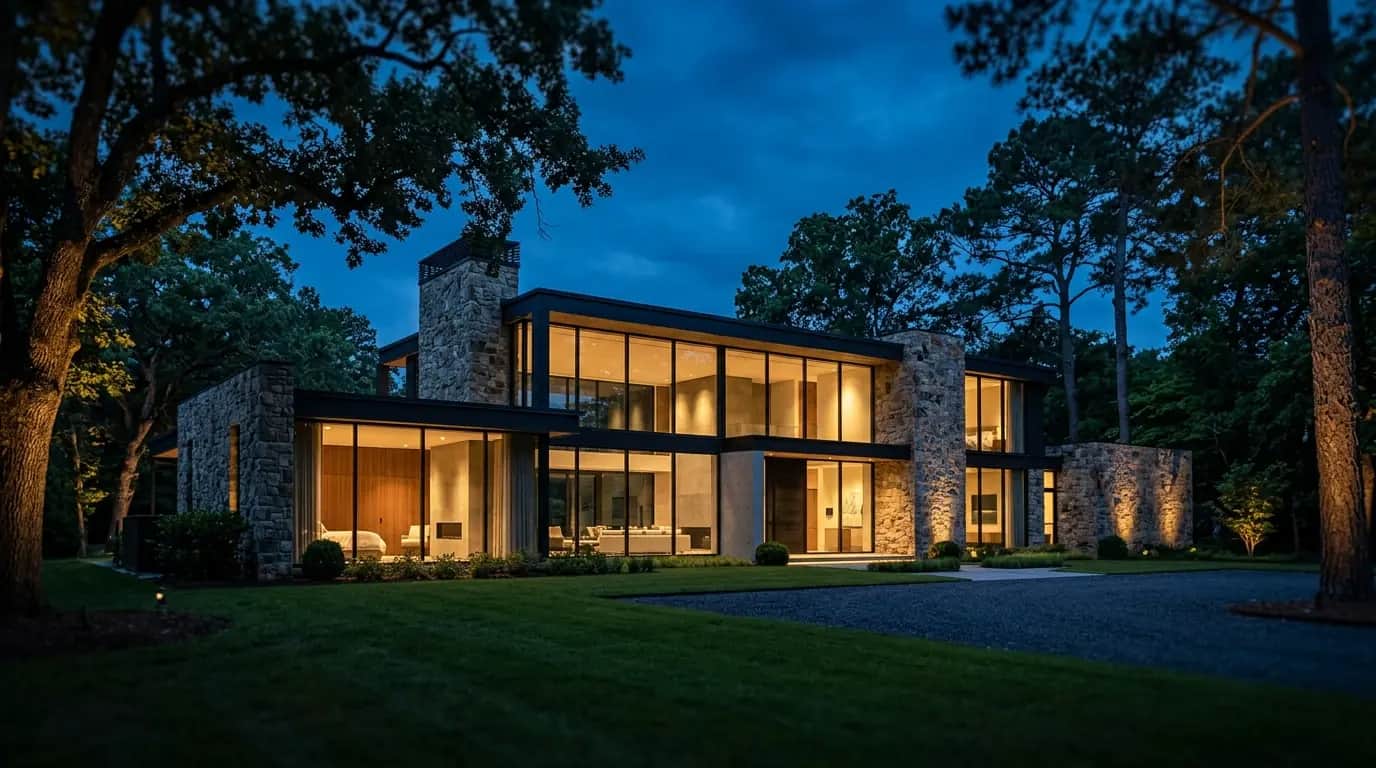
When you switch to a cinematic, low-light aesthetic, shooting a modern stone-and-glass estate at dusk, for example, you capture a property's lived-in warmth. The glowing interior light against a deep twilight sky tells a story of arriving home after a long day. It invites the viewer to imagine themselves sitting by that hearth or pouring a drink at that kitchen island. By allowing shadows to exist, you elevate the home from a physical commodity into an emotional destination.
2. A case study in engagement: wide vs. vignette
Consider how a high-end architectural magazine covers design. They rarely lead with an ultra-wide shot that crams an entire open-floor plan into a single frame. Instead, they lead with tight, intentional vignettes.
- The corporate approach: a wide-angle lens captures the kitchen island, the refrigerator, the breakfast nook, and the hallway to the garage all in one cluttered shot. It feels clinical and overwhelming.
- The editorial approach: a tight, shallow-depth-of-field shot focuses purely on the morning light catching the edge of a custom marble waterfall island, with a soft-focus background of a high-end range.
The performance result: on platforms like Instagram and LinkedIn, the editorial vignette consistently generates higher save and share metrics. Why? Because it feels like human art, not a transactional sales pitch. When your feed looks like a curated design magazine rather than a digital listing catalog, you attract a higher caliber of client, one who values design, presentation, and premium representation.
3. How to curate an editorial brand grid
Transitioning your brand to a cinematic aesthetic requires a strict commitment to curation. You cannot post a moody architectural shot on Monday, then a bright neon "SOLD!" graphic with a cartoon key on Tuesday. The contrast will shatter your brand authority.
- Control the light: work with photographers who shoot with natural, directional light rather than artificial flash. Schedule shoots during blue hour (just after sunset) or golden hour (early morning) for rich, saturated tones.
- Build an architectural hierarchy: make sure your website and social feeds match this ethos. If your digital storefront values minimalism, clean typography, and full-bleed imagery, your marketing will naturally resonate with luxury consumers.
- Tell the behind-the-scenes story: don't just post the final perfect image. Share the process, a stylist adjusting a branch in a ceramic vase, the slow transition of natural light hitting a living room wall.
4. A practical shot list for your next listing
You don't need to abandon standard MLS photography, buyers still need to see every room clearly, but you can build a second, editorial-only shot list into every shoot without adding much time on-site.
- One hero exterior at blue hour. Interior lights on, exterior sky still holding color, this is almost always the single highest-performing image in a listing set.
- Three tight material details. A hand on a brass door pull, the grain of a live-edge dining table, steam rising off coffee on a kitchen island. These are the images people save, not the wide-angle living room shot.
- One human-in-frame moment. A hand pulling back a curtain, a figure silhouetted in a doorway. It doesn't need to show a face, it needs to suggest a life being lived in the space.
- A single wide establishing shot, used sparingly. You still need one image that orients a viewer to the layout, just don't let it be the image that represents your brand.
5. Editing: restraint over saturation
The editorial look isn't about a heavier filter, it's about a lighter hand. Standard real estate editing pushes shadows up and saturation up to make every room look uniformly bright. The editorial approach does close to the opposite: preserve real shadow detail, keep whites warm rather than clinical-blue, and resist the urge to brighten a moody frame just because it's darker than what you're used to posting.
A useful test before you post: if the image would look at home in a design magazine or a hotel's Instagram feed, it's probably right. If it looks like it belongs on a real estate portal's search results page, it needs another pass.
6. Where agents get this wrong
The most common mistake isn't choosing the wrong photographer, it's inconsistency after the shoot. An agent invests in one beautifully shot listing, posts the editorial images for two weeks, then reverts to a phone snapshot and a bright "JUST LISTED" graphic for the next property because there wasn't budget or time for another full shoot. That whiplash undoes the brand work the first shoot did.
The fix isn't shooting every listing at magazine level, it's applying the same restrained editing style and color grade to every image you post, even a quick phone-shot detail photo, so your feed reads as one consistent aesthetic rather than a collection of unrelated posts.
7. Talking your seller into it
Not every seller instinctively understands why a moody twilight shot outperforms a bright midday one, some will push back and ask for the brighter, "safer" option they're used to seeing. This is a conversation worth having before the shoot, not after.
Frame it around outcome, not aesthetics: explain that the goal isn't a prettier photo for its own sake, it's a listing that gets saved and shared instead of scrolled past, which means more eyes on their home in the first critical days on market. Showing a seller a side-by-side comparison, a standard bright shot next to an editorial one, from a past listing, usually settles the debate faster than explaining the theory behind it.
8. What to keep from the standard approach
None of this means abandoning practical, bright, well-lit photography entirely. Buyers still need a complete, accurate visual sense of every room before they book a showing, and MLS syndication still favors clear, well-exposed images for that functional purpose. The move isn't replacing standard photography, it's adding an editorial layer on top of it for your own brand and social presence, while keeping the practical, fully-lit set as the functional backbone of the actual listing.
Luxury is defined by restraint, not noise. By stepping away from the chaotic, bright corporate style and embracing a moody, editorial perspective, you stop the scroll, command attention, and signal to the market that you handle real estate at an entirely different tier.
Quick Answers
Do I need a professional photographer, or can I shoot this myself? A professional makes the transition faster and more consistent, but the underlying principles, natural light, tight vignettes over wide shots, restrained editing, apply just as much to a well-shot phone photo. Start applying the framework to whatever camera you have now, upgrade equipment once the aesthetic itself is dialed in.
How many editorial images do I actually need per listing? Five to eight strong images outperform twenty mediocre ones for social purposes. Quality and consistency of aesthetic matter more than volume.
What if my current photographer only shoots the bright, standard style? Have the conversation directly, share reference images of the look you want, and ask if they're willing to shoot one blue-hour exterior and a few tight vignettes alongside the standard set. If they're not able to accommodate it, that's worth knowing before your next shoot, not after.
Make a Nest builds working agents a professional website, built around your actual production, live in 72 hours. School Estate students and alumni get the $595 setup fee waived with code SCHOOLESTATE.
Learn about Make a Nest